NEVER STRAIGHT / BRANDING / WEST HANTS PRIDE
In their fourth year, West Hants Pride finally registered as a proper society. Awesome! I’ve been involved in the group since its inception, my personal philosophy being that EVERY community deserves representation of those who live there. The Queer Community included.. It thrills me beyond words to see the colour and the energy and the comfort that we’ve brought to my new home of Windsor, NS.
Now that we’re officially legit, we can embark on a new mission for branding. See, in the past, we’d been using whatever graphics a previous creative had made. Swapping dates on the existing poster, updating the locations on last year’s post; things like that. But now? Now we can truly be ourselves. And everyone deserves that!
I knew the new brand would be colourful; that’s obvious. But the ability to recreate just how quirky and bizarre and unique our community truly is? That’ll be the challenge. And I love where we ended up.
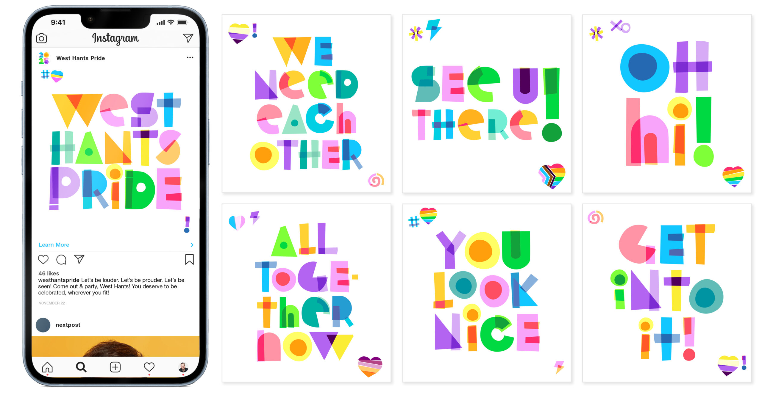
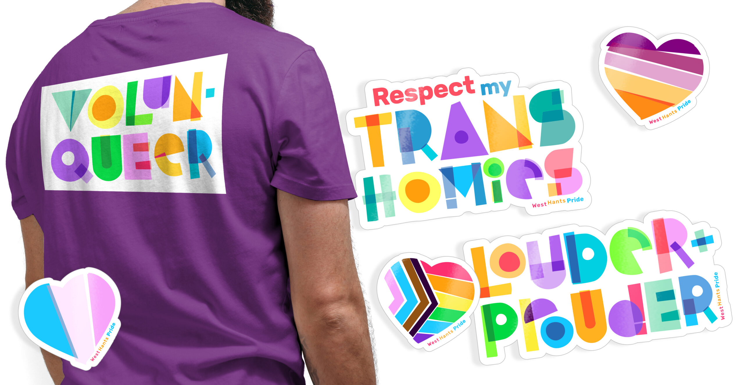
The new WH Pride brand is bold, off-kilter, and vibrant af. An entire alphabet of custom letters was created, including several alternates for the most common letters. Several stylized hearts were created, representing 10 of the most recognizable flags. Additional illustrative elements were crafted. While you work on such a huge set of assets, you become thoughtful, and I came up with two single rules for every decision made in the entire brand library:
1. Always colourful
2. Never straight
While this is strong enough to be a public-facing tagline, it’s a stellar example of an internal guiding principle.
You’re looking at Social Media posts (every one custom-built), Volun-queer shirts for Parade Day, and a few of our 2025 Sticker designs. Not pictured? Banners, Posters, Digital Signage, Social Media profile imagery, and about 35 additional posts (yes, all of which are custom-designed too).